LOGO DESIGN
IDENTITY DESIGN
PACKAGING DESIGN
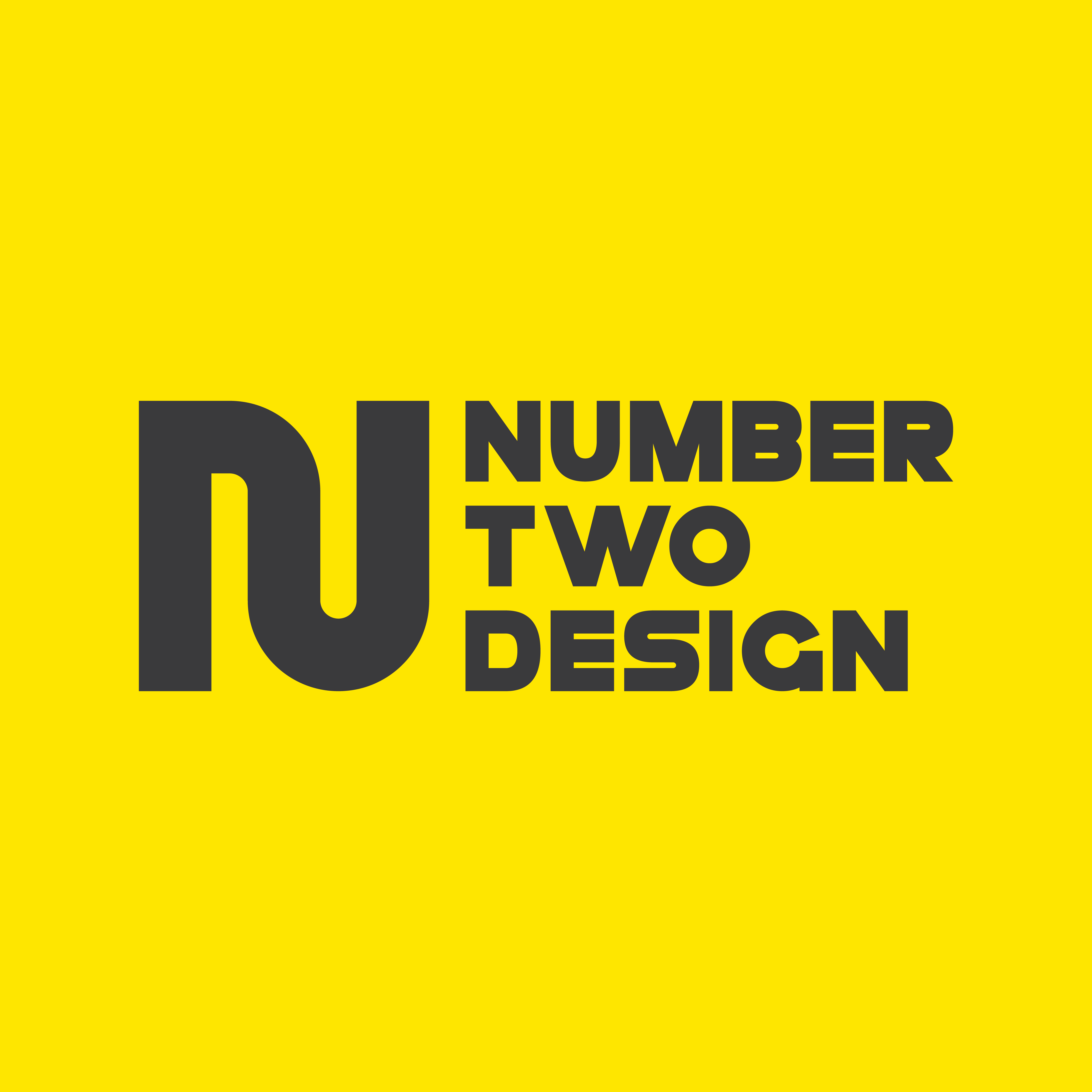
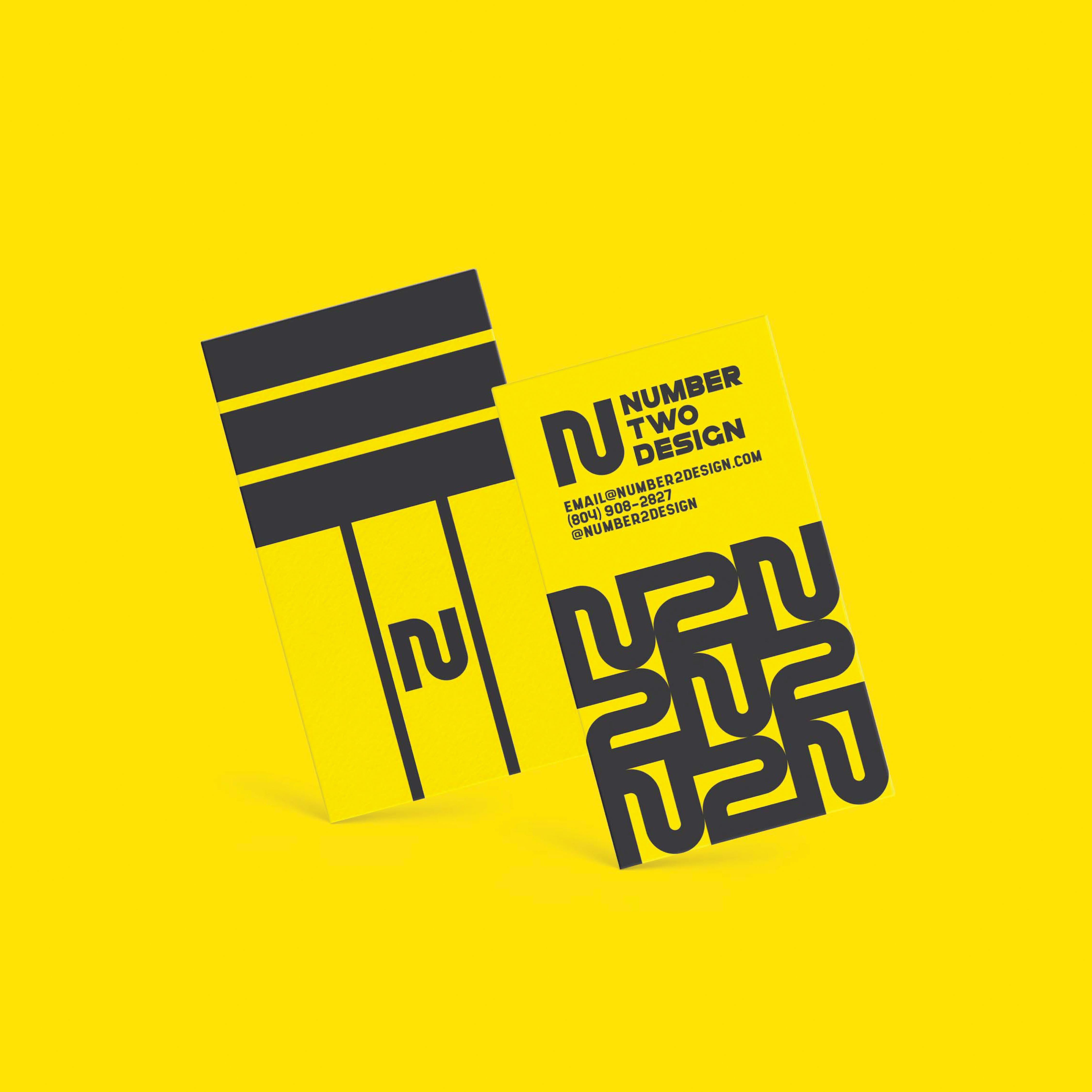
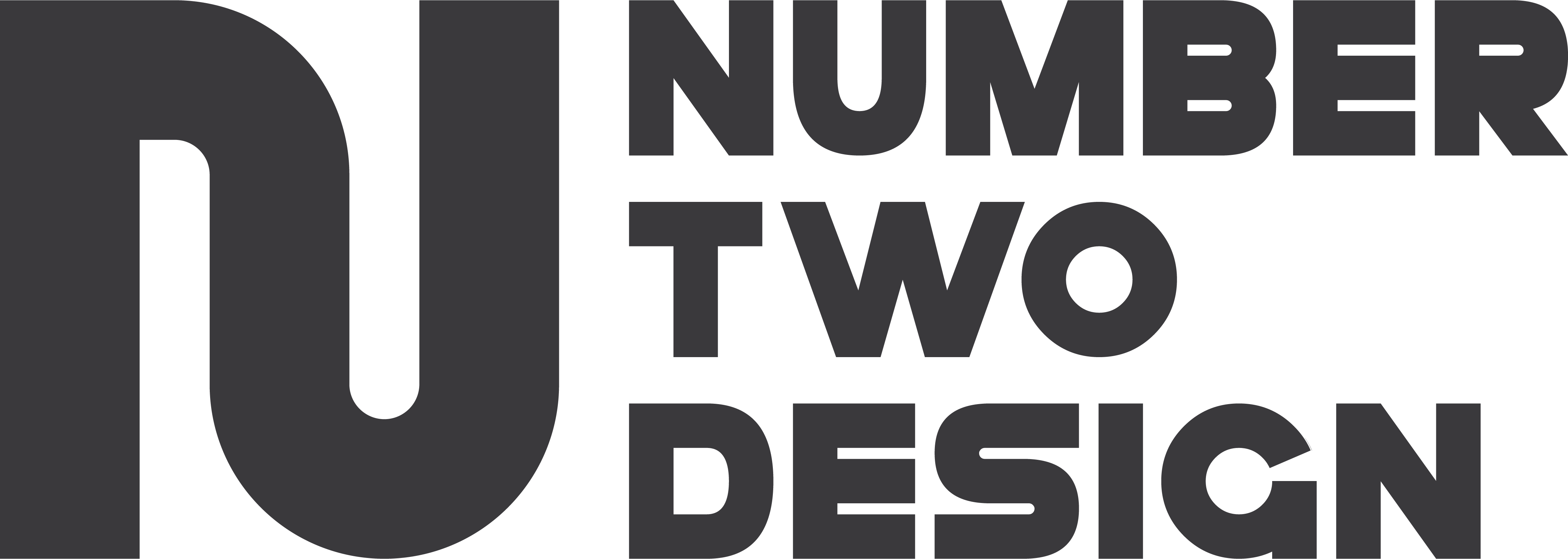
This logo was made for my personal brand. I wanted to combine the glyphs for N and 2 to create a memorably simple mark. This logo went through dozens upon dozens of iterations and variations before I nailed it down. That was mostly due to the fact that “you're your own worst client , ” so I always kept feeling that I could make the mark even more simple and memorable.
