LOGO DESIGN
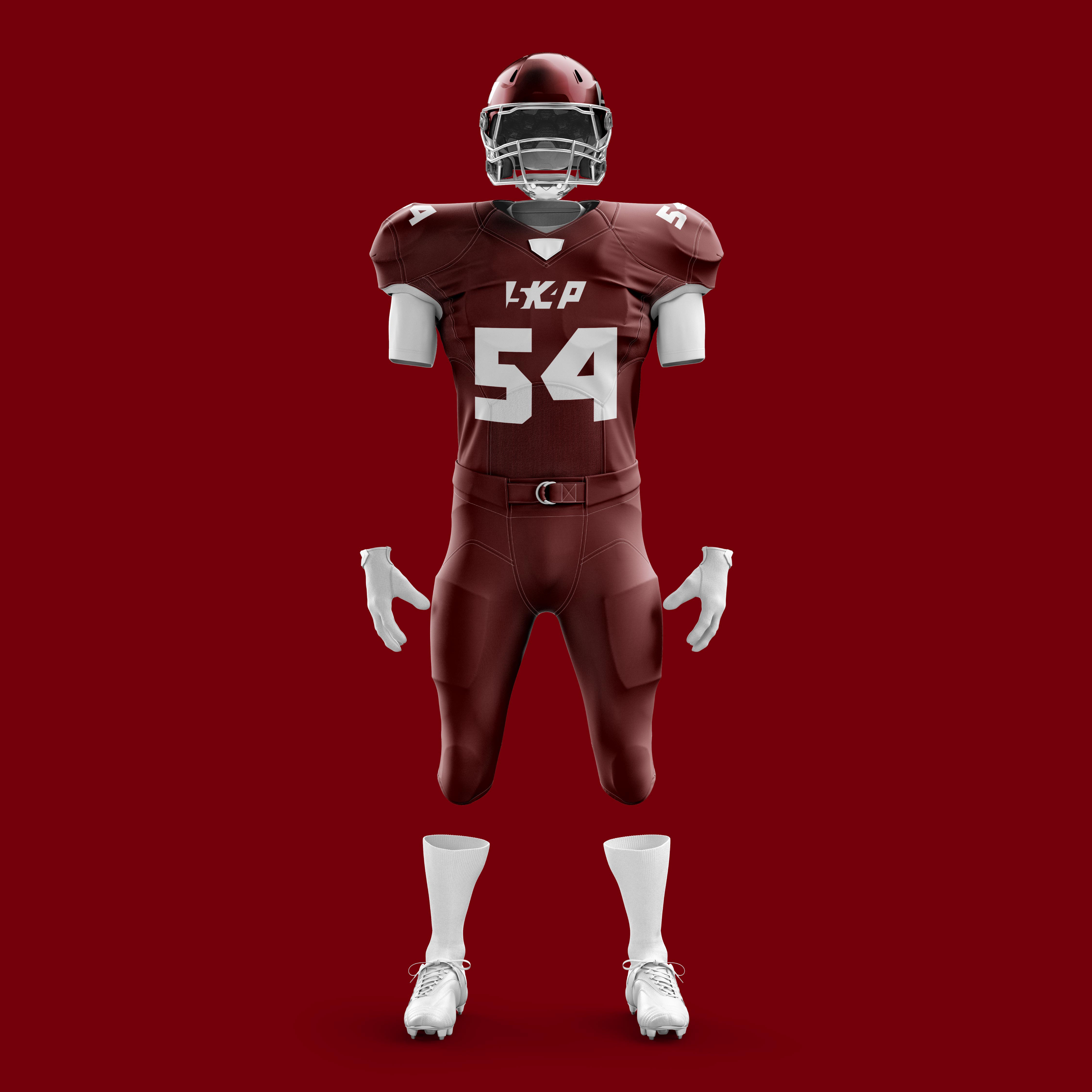
This was a logo I designed for a sports agent for use by his athlete. They wanted me to create a logo that was comprised only of the set of two letters and two numbers without using any icons or literal imagery. I went the direction of using negative space to give of the illusion of seeing both sets depending on where you look.


